WebApp Library CSS Styles Guide
Document information
- Canonical URL:
/docs/05_apps-webhooks-and-surfaces/32_webapp-library-css-styles-guide - Version:
2026-05-08 - Tags:
webapps,css,library
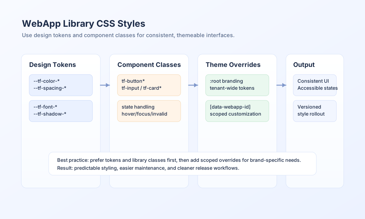
This guide explains how to style WebApps with the built-in Tealfabric CSS design tokens and component classes. It helps you keep pages visually consistent while still allowing controlled customization for branding and layout needs. By using the provided --tf-* variables and tf-* classes, you can build production-ready interfaces faster and reduce maintenance drift.
Start with design tokens
The design system exposes CSS custom properties using the --tf- prefix for colors, spacing, typography, borders, shadows, transitions, and layering. Treat these tokens as the default source of truth instead of hardcoded values so themes stay coherent as your app evolves. When you need a visual change, update tokens first and custom component overrides second.
:root {
  --tf-color-primary: #3b82f6;
  --tf-spacing-4: 1rem;
  --tf-border-radius-lg: 0.5rem;
  --tf-shadow-md: 0 4px 6px -1px rgb(0 0 0 / 0.1);
}
Build with library classes before custom CSS
Use tf-* classes for standard controls such as buttons, form fields, cards, tables, and modals before creating custom style blocks. This gives you consistent states (hover, focus, disabled, invalid) and keeps accessibility behavior closer to platform defaults. Custom classes work best when they extend a component pattern instead of replacing it entirely.
<div class="tf-card-default">
  <div class="tf-card-header">
    <h3 class="tf-section-title">Profile Settings</h3>
  </div>
  <div class="tf-field-wrapper">
    <label class="tf-label tf-label-required" for="email">Email</label>
    <input class="tf-input" id="email" name="email" type="email" />
  </div>
  <div class="tf-card-footer-actions">
    <button class="tf-button tf-button-primary">Save</button>
  </div>
</div>
Apply theme overrides safely
Theme overrides should be scoped to the smallest necessary context so changes do not leak across unrelated WebApps. Global overrides are useful for tenant-wide branding, while scoped selectors are better for one-off campaign or microsite styling. Keep contrast and focus visibility intact when changing colors and shadows.
[data-webapp-id="support-portal"] {
  --tf-color-primary: #0f766e;
  --tf-color-primary-hover: #115e59;
  --tf-border-radius-lg: 0.75rem;
}
Validate styling changes through API-driven delivery
When your team manages WebApp markup and styling through deployment pipelines, publish updates with explicit API calls and versioning so rollout is traceable. This helps teams coordinate style changes with content and process behavior changes in the same release cycle.
const baseUrl = "https://api.example.com/api/v1/webapps";
const apiKey = "<API_KEY>";
const tenantId = "<TENANT_ID>";

async function publishStyledWebApp(webappId: string, version: number): Promise<void> {
  const response = await fetch(`${baseUrl}/${encodeURIComponent(webappId)}/publish`, {
    method: "POST",
    headers: {
      "X-API-Key": apiKey,
      "X-Tenant-ID": tenantId,
      "Content-Type": "application/json",
    },
    body: JSON.stringify({ version }),
  });
  if (!response.ok) throw new Error(`Publish failed: ${response.status}`);
}
curl -X POST "https://api.example.com/api/v1/webapps/<ENTITY_ID>/publish" \
-H "X-API-Key: <API_KEY>" \
-H "X-Tenant-ID: <TENANT_ID>" \
-H "Content-Type: application/json" \
-d '{
"version": 2
}'
{
  "success": true,
  "message": "Version published successfully"
}
Keep styling maintainable over time
Maintainability improves when teams standardize spacing tokens, typography scales, and component states instead of adding one-off visual rules in each feature. Run visual QA for focus states, error fields, and responsive layouts before publishing style changes. This prevents regressions and ensures user-facing surfaces remain clear and accessible.
See also
The CSS library works best when tokens define design intent and component classes deliver behavior consistently. With that approach, you can customize confidently while preserving a coherent cross-app user experience.
| Name ↕ |
|---|
Lists
Classes:
.tf-list-wrapper- List container (white background, border, shadow).tf-list- List element (ul).tf-list-item- List item (li).tf-list-avatar- Avatar circle in list items.tf-list-primary- Primary text in list item.tf-list-secondary- Secondary text in list item.tf-list-actions- Action buttons container in list items.tf-list-empty- Empty state container.tf-list-pagination- Pagination controls container
Example:
<div class="tf-list-wrapper">
  <ul class="tf-list">
    <li class="tf-list-item">
      <div class="tf-list-avatar">JD</div>
      <div>
        <div class="tf-list-primary">John Doe</div>
        <div class="tf-list-secondary">john@example.com</div>
      </div>
      <div class="tf-list-actions">
        <tf-button>Edit</tf-button>
      </div>
    </li>
  </ul>
</div>
Modals
Classes:
.tf-modal- Modal container (fixed positioning, centered).tf-modal-backdrop- Modal backdrop overlay.tf-modal-header- Modal header section.tf-modal-close- Close button in header.tf-modal-body- Modal body content.tf-modal-footer- Modal footer section
Example:
<div class="tf-modal-backdrop"></div>
<div class="tf-modal">
  <div class="tf-modal-header">
    <h2>Modal Title</h2>
    <button class="tf-modal-close">×</button>
  </div>
  <div class="tf-modal-body">
    <!-- Modal content -->
  </div>
  <div class="tf-modal-footer">
    <tf-button>Cancel</tf-button>
    <tf-button>Save</tf-button>
  </div>
</div>
Step Progress (Multi-step Forms)
Classes:
.tf-step-progress- Progress indicator container.tf-step-item- Individual step item.tf-step-number- Step number circle.tf-step-navigation- Navigation buttons container
Example:
<div class="tf-step-progress">
  <div class="tf-step-item">
    <div class="tf-step-number">1</div>
    <div>Step Title</div>
  </div>
</div>
<div class="tf-step-navigation">
  <tf-button>Previous</tf-button>
  <tf-button>Next</tf-button>
</div>
Progress Indicator
Classes:
.tf-progress-overlay- Full-screen loading overlay.tf-progress-spinner- Spinner container.tf-spinner- Animated spinner element
Example:
<div class="tf-progress-overlay">
  <div class="tf-progress-spinner">
    <div class="tf-spinner"></div>
  </div>
</div>
Alert/Notice/Info Boxes
Base Classes:
.tf-alert- Base alert box.tf-info- Info box (alias for.tf-alert-info).tf-notice- Notice box (alias for.tf-alert)
Variants:
.tf-alert-info/.tf-info- Information alert (blue).tf-alert-success- Success alert (green).tf-alert-warning- Warning alert (amber).tf-alert-danger/.tf-alert-error- Error alert (red)
Features:
- Left border accent color
- Background color matching alert type
- Text color for readability
- Code block styling support
Example:
<div class="tf-info">
  <strong>Info:</strong> This is an informational message.
  You can use <code>code</code> inside alerts.
</div>

<div class="tf-alert-success">
  Operation completed successfully!
</div>

<div class="tf-alert-warning">
  Warning: Please review your input.
</div>

<div class="tf-alert-danger">
  Error: Something went wrong.
</div>
Utility Classes
Container
.tf-container
Responsive container with max-width and padding. Centers content and adjusts padding based on screen size.
Example:
<div class="tf-container">
  <!-- Content -->
</div>
Typography
.tf-page-title    /* Large page title */
.tf-section-title /* Section heading */
Example:
<h1 class="tf-page-title">Page Title</h1>
<h2 class="tf-section-title">Section Title</h2>
State Classes
Validation States
.tf-field-invalid- Applied to inputs with validation errors (red border)
Visibility States
- Elements with
display: noneare hidden (used for conditional fields)
Theming
Overriding CSS Variables
You can override any CSS variable to customize the theme. Variables can be overridden globally or scoped to a specific webapp.
Global Override
:root {
  --tf-color-primary: #8b5cf6;  /* Change primary color to purple */
  --tf-spacing-md: 1.5rem;       /* Increase default spacing */
}
Webapp-Specific Override
[data-webapp-id="my-webapp"] {
  --tf-color-primary: #10b981;  /* Green theme for this webapp */
  --tf-border-radius-lg: 1rem;  /* Larger border radius */
}
Schema-Based Theming
The library automatically injects theme variables from the schema:
{
  "page": {
    "theme": {
      "colorPrimary": "#8b5cf6",
      "spacingMd": "1.5rem",
      "borderRadiusLg": "1rem"
    }
  }
}
These are converted to CSS variables:
colorPrimary→--tf-color-primaryspacingMd→--tf-spacing-mdborderRadiusLg→--tf-border-radius-lg
Usage Examples
Custom Button Styling
.custom-primary-button {
  background-color: var(--tf-color-primary);
  color: white;
  padding: var(--tf-spacing-2) var(--tf-spacing-4);
  border-radius: var(--tf-border-radius);
  font-weight: var(--tf-font-weight-medium);
  transition: all var(--tf-transition-base);
}

.custom-primary-button:hover {
  background-color: var(--tf-color-primary-hover);
  box-shadow: var(--tf-shadow-md);
}
Custom Card Styling
.custom-card {
  background-color: white;
  border: var(--tf-border-width) solid var(--tf-border-color-light);
  border-radius: var(--tf-border-radius-lg);
  padding: var(--tf-spacing-6);
  box-shadow: var(--tf-shadow);
  margin-bottom: var(--tf-spacing-6);
}
Custom Form Field Styling
.custom-field {
  margin-bottom: var(--tf-spacing-5);
}

.custom-field-label {
  font-size: var(--tf-font-size-sm);
  font-weight: var(--tf-font-weight-medium);
  color: var(--tf-color-gray-700);
  margin-bottom: var(--tf-spacing-2);
}

.custom-field-input {
  width: 100%;
  padding: var(--tf-spacing-2) var(--tf-spacing-3);
  border: var(--tf-border-width) solid var(--tf-border-color);
  border-radius: var(--tf-border-radius);
  font-size: var(--tf-font-size-base);
  transition: border-color var(--tf-transition-fast);
}

.custom-field-input:focus {
  outline: none;
  border-color: var(--tf-color-primary);
  box-shadow: 0 0 0 3px rgba(59, 130, 246, 0.1);
}
Responsive Spacing
.responsive-container {
  padding: var(--tf-spacing-4);
}

@media (min-width: 640px) {
  .responsive-container {
    padding: var(--tf-spacing-6);
  }
}

@media (min-width: 1024px) {
  .responsive-container {
    padding: var(--tf-spacing-8);
  }
}
Dark Mode Support (Future)
@media (prefers-color-scheme: dark) {
  :root {
    --tf-color-gray-50: #111827;
    --tf-color-gray-900: #f9fafb;
    /* Invert gray scale for dark mode */
  }
}
Best Practices
1. Use CSS Variables for Theming
Always use CSS variables instead of hardcoded values to maintain consistency and enable easy theming.
/* ✅ Good */
.button {
  background-color: var(--tf-color-primary);
  padding: var(--tf-spacing-2) var(--tf-spacing-4);
}

/* ❌ Bad */
.button {
  background-color: #3b82f6;
  padding: 0.5rem 1rem;
}
2. Leverage Component Classes
Use existing component classes when possible rather than creating custom styles.
<!-- ✅ Good - Uses library classes -->
<tf-button class="tf-button tf-button-primary">Submit</tf-button>

<!-- ❌ Bad - Custom styling that duplicates library functionality -->
<button class="my-custom-button">Submit</button>
3. Extend, Don't Override
Extend component classes rather than overriding them completely.
/* ✅ Good - Extends existing styles */
.my-special-button {
  /* Inherit base button styles */
  composes: tf-button tf-button-primary;
  /* Add custom styles */
  text-transform: uppercase;
  letter-spacing: 0.05em;
}

/* ❌ Bad - Completely overrides */
.my-special-button {
  /* Loses all library button functionality */
}
4. Use Semantic Spacing Scale
Use the spacing scale consistently for predictable layouts.
/* ✅ Good - Uses spacing scale */
.card {
  padding: var(--tf-spacing-6);
  margin-bottom: var(--tf-spacing-4);
  gap: var(--tf-spacing-2);
}

/* ❌ Bad - Arbitrary values */
.card {
  padding: 23px;
  margin-bottom: 17px;
  gap: 9px;
}
5. Maintain Accessibility
Ensure custom styles maintain accessibility features like focus states.
/* ✅ Good - Includes focus state */
.custom-input:focus {
  outline: 2px solid transparent;
  outline-offset: 2px;
  box-shadow: 0 0 0 3px rgba(59, 130, 246, 0.5);
}

/* ❌ Bad - Removes focus indication */
.custom-input:focus {
  outline: none;
}
Browser Support
All CSS features used are supported in modern browsers:
- CSS Custom Properties (CSS Variables) - Supported in all modern browsers
- Flexbox - Fully supported
- CSS Grid - Fully supported
- Backdrop Filter - Supported in modern browsers (graceful degradation)
- CSS Animations - Fully supported
Migration from Custom Styles
If you have existing custom styles, you can gradually migrate to use library variables:
Before
.my-button {
  background-color: #3b82f6;
  padding: 0.5rem 1rem;
  border-radius: 0.375rem;
  color: white;
}
After
.my-button {
  background-color: var(--tf-color-primary);
  padding: var(--tf-spacing-2) var(--tf-spacing-4);
  border-radius: var(--tf-border-radius);
  color: white;
}
Reference Quick Links
- TailwindCSS4 Documentation: tailwindcss.com
- CSS Custom Properties MDN: MDN CSS Variables
- Component Examples: See User Guide
Summary
The WebApp Component Library provides a comprehensive set of CSS custom properties and classes that follow TailwindCSS4 design system conventions. By using these styles:
- ✅ Consistent Design: All components follow the same design language
- ✅ Easy Theming: Override CSS variables to customize appearance
- ✅ Responsive: Built-in responsive considerations
- ✅ Accessible: Proper focus states and contrast ratios
- ✅ Modern: Uses latest CSS features and best practices
No custom CSS is required to get good-looking pages, but you have full control to customize when needed.
-->